
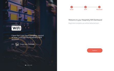
Hospitality WiFi Customer Dashboard
Self-Service Dashboard
Project Overview
What was it?
A responsive customer dashboard concept for hospitality WiFi users that centralizes account health, billing, network status, speed performance, notifications, onboarding, and support into one guided experience.
Who was it for?
The dashboard was designed for hotel guests, property staff, and support-adjacent users with different levels of technical comfort. Some users only needed a simple answer like “Is my WiFi working?” while others needed more detailed information about payments, service status, speed trends, or network interruptions.
Problem
WiFi issues in hospitality environments are stressful because users often cannot tell whether the problem is caused by billing, account setup, device issues, local network performance, or a larger outage. Existing dashboard patterns can expose too much technical information too quickly, while support-heavy workflows force users to ask for help before they understand what is happening.
Solution
I designed a dashboard that translates account and network signals into clear status cards, prioritized alerts, guided next steps, and focused detail views. Instead of asking users to interpret raw technical data, the experience explains what changed, why it matters, and what action to take next.
Outcome
Results
One hub for service health
3 user comfort levels supported
4 core workflows connected
Every alert paired with next steps
The Experience
Flow 1 — Understanding Account Health at a Glance
This flow introduces the dashboard as a quick-read command center for hospitality WiFi users. The overview helps users immediately understand whether their account is active, whether service is healthy, whether payment action is needed, and whether there are any network issues affecting their connection.
The goal was to make the first screen useful for both non-technical guests and more technical property staff. High-priority information is surfaced through simple cards, while supporting details remain available for users who need to investigate further.

Flow 2 — Resolving Billing and Payment Issues
This flow focuses on moments where billing or payment status may affect service access. Instead of showing a generic account warning, the dashboard explains what is due, what payment method is connected, whether service could be interrupted, and what the user can do next.
The experience is designed to reduce uncertainty during a high-stress moment. Users can quickly understand whether their issue is financial, technical, or account-related before contacting support.

Flow 3 — Monitoring Network Status and Speed
This flow translates technical service information into a more understandable network health experience. Users can view speed performance, service status, outage indicators, and recent network activity without needing to understand raw diagnostics.
For less technical users, the dashboard provides plain-language status labels and recommended next steps. For more technical users, charts and performance details provide enough depth to understand trends and service quality over time.


Flow 4 — Guiding Users Through Alerts, Support, and Onboarding
This flow shows how the dashboard helps users before and after something goes wrong. Notifications communicate service changes or issues proactively, onboarding introduces the dashboard’s most important features, and support pathways give users clear options when they need help.
The intent was to make the product feel less like a technical control panel and more like a guided service experience that supports users throughout the full WiFi lifecycle.


Feedback on the project? Want to discuss the tagging system further? You can find me on LinkedIn.